
What is causal inference in statistics data science? While „correlation does not imply causation“, it is possible to identify causal effects even in data that does not come from randomized controlled trials. Our AI expert, Dr. Julien Siebert, just published a paper on the applications of statistical causal inference in software engineering. In this Fraunhofer IESE blog post, he gives an introduction to the topic of causal inference, its benefits, its limitations, and other pointers to deepen our readers‘ knowledge of this topic.
In general, the best way to measure the causal effect of an action („a treatment“) on a system of interest („the outcome“) is to perform a randomized controlled trial.
However, in many cases, performing such a controlled experiment is not possible (for practical or ethical reasons). In such cases, analysts are then left with so-called „observational data“; i.e., data that has been gathered in an uncontrolled setting.
The problem with such data is that the observed effect might be due to different factors: some truly causal ones, and some others due to unrelated correlation (a.k.a. spurious correlation).
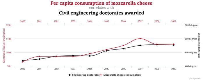
Finding methods for separating the wheat (causal effects) from the chaff (spurious correlations), that is, identifying causal effects from the nets of spurious correlations, has been the focus of researchers in the field of causal inference such as Judea Pearl and colleagues (Pearl & Mackenzie 2018; Pearl, Glymour & Jewell 2016).
In this blog post, I will present a short introduction to the topic of causal inference.
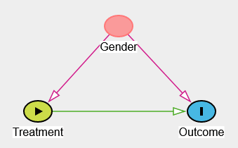
Example: Simpson’s paradox
One important thing to realize is that, contrary to widespread belief in data science, data cannot speak for itself. Or at least, in some cases known as statistical paradoxes, data can be interpreted in completely opposite directions, especially if the underlying assumptions about how the data was generated are not explicit.
The typical example, often used in many textbooks on causal inference, is Simpson’s paradox (Pearl 2013), illustrated in the figure below.

Modeling causal assumptions
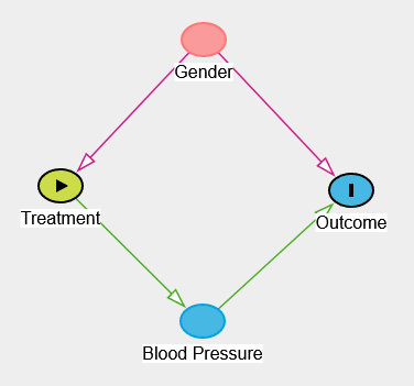
In order to solve the paradox, it is necessary to make some assumptions explicit. In our example, if gender influences treatment uptake (e.g., if men are more likely to take the drug) and if gender also influences recovery (e.g., if women have lower blood pressure), then gender is a so-called confounder. In this case, it is necessary to analyze the data separately for the different genders.
Modeling these causal hypotheses is the first step in causal inference. Typically, these assumptions take the form of a causal graph, where nodes represent variables, links represent potential direct causal effects, and no link represents the strong hypothesis that there is no direct effect between the variables.
One of the good things about having such a representation (apart from making causal hypotheses explicit) is that it is technically possible to try to falsify it by assessing which variables have to be independent in the data.
Identifying whether causal effect can be computed from data
The graphical structure helps to disentangle correlations from causality. Through the application of a causal identification method called the do-calculus (Pearl, 2012), it is possible to decide whether we can measure causal effect from observational data and how the data needs to be analyzed. Going back to Simpson’s paradox, the application of the do-calculus can tell us whether we should analyze the data separately for each gender or whether we should analyze it for the whole population. Technically, the do-calculus involves the concepts of d-separation as well as backdoor and frontdoor criteria, which are beyond the scope of this blog post (the interested reader can jump to the pointers section below), but luckily for us, the do-calculus has been implemented in libraries such as DoWhy or DAGitty, and identification can be easily automated.
Estimating causal effects from data
Once a causal effect has been identified, the next step is to estimate that effect using the available data. This is where Machine Learning comes into play. Note that we are not talking about classical Machine Learning algorithms, but about algorithms dedicated to the estimation of causal effects, such as TARNet, T-learner, or X-learner (the adventurous reader can refer to chapter 7 of Brady Neal’s lecture Introduction to Causal Inference from a Machine Learning Perspective). Again, several implementations are available: Besides DoWhy, which was already mentioned above, CausalML is also worth a look.
Refutation: challenging the effect found
Now that a causal effect has been both identified and estimated, how can we trust our results? In science, ultimately, we can never prove that a causal effect is true. We can only try to falsify it. Here, it is interesting to take a look at the DoWhy library and the proposed refutation methods. Here are some methods for illustration:
- Add Random Common Cause: Does the estimation method change its estimate after we add an independent random variable as a common cause to the dataset? (Hint: It should not.)
- Placebo Treatment: What happens to the estimated causal effect when we replace the true treatment variable with an independent random variable? (Hint: The effect should go to zero.)
- Dummy Outcome: What happens to the estimated causal effect when we replace the true outcome variable with an independent random variable? (Hint: The effect should go to zero.)
Conclusion
Doing randomized control trials is the gold standard, but when these are not possible, the whole field of causal inference helps in separating causal effects from spurious correlations.
Interested in this topic?
Feel free to read the paper and/or to contact our expert Dr. Julien Siebert via Mail or LinkedIn.
Pointers:
Here are some pointers for the interested reader.
Introduction to the topic:
- Was, wie, warum? – Einführungskurs Kausale Inferenz (German, accessible): https://ki-campus.org/courses/wwweki
- Introduction to Causal Inference from a machine learning perspective (English, more technical): https://www.bradyneal.com/causal-inference-course
Books to read:
- The Book of Why: The New Science of Cause and Effect. Judea Pearl and Dana Mackenzie. 2018. Penguin (UK). http://bayes.cs.ucla.edu/WHY/. ISBN 9780141982410 (English, accessible).
- The Effect: An Introduction to Research Design and Causality. Nick Huntington-Klein. 2022. CRC Press. https://theeffectbook.net/. ISBN 1032125780 (English, accessible).
- Causal inference in statistics, A Primer. Judea Pearl, Madelyn Glymour, and Nicholas P. Jewell. 2016. Wiley. http://bayes.cs.ucla.edu/PRIMER/. ISBN: 1119186846 (English, more technical).
Tools:
- DAGitty | Draw and analyze causal diagrams: http://www.dagitty.net/
- DoWhy | An end-to-end library for causal inference: https://py-why.github.io/dowhy/
References:
Judea Pearl. 2012. The Do-Calculus Revisited. Keynote Lecture, August 17, 2012. UAI-2012 Conference, Catalina, CA. TECHNICAL REPORT R-402. https://ftp.cs.ucla.edu/pub/stat_ser/r402.pdf
Judea Pearl. 2013. Understanding Simpson’s Paradox. TECHNICAL REPORT R-414. https://ftp.cs.ucla.edu/pub/stat_ser/r414.pdf
Judea Pearl and Dana Mackenzie. 2018. The Book of Why. The New Science of Cause and Effect. Penguin (UK). ISBN: 9780141982410
Judea Pearl, Madelyn Glymour, and Nicholas P. Jewell. 2016. Causal Inference in Statistics. A Primer. Wiley. ISBN: 1119186846

